
Pattern Mixing: The Informal Rules That Actually Guide It
Mixing prints and patterns looks effortless on some people and chaotic on others. Here's the logic behind what tends to work and why.
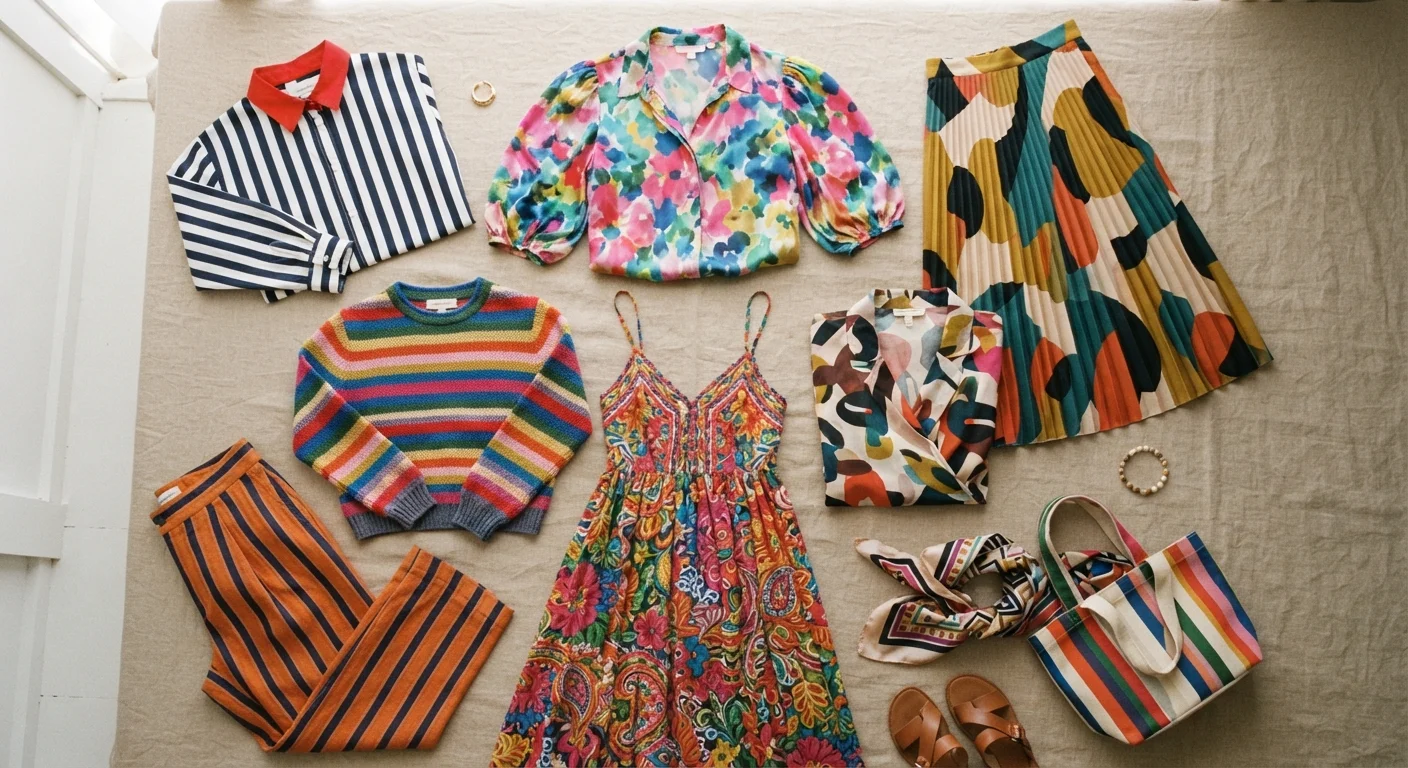
Photo: SaverSteals.com editorial
—— In This Article
Key Takeaways
- Scale contrast — pairing a large print with a small one — is the most reliable starting point for pattern mixing.
- A shared color between two patterns creates visual cohesion without requiring a matching print.
- One 'anchor' solid piece can stabilize even an ambitious multi-pattern outfit.
- Texture difference between patterns adds depth and reduces visual noise.
- There are no absolute rules — understanding the principles lets you break them with intention.
Why Pattern Mixing Looks Effortless on Some People
Pattern mixing isn't a talent you're born with — it's a set of loose principles that become second nature once you understand them. Most people who seem to pull it off instinctively have internalized a handful of concepts: scale, color relationship, and visual weight. Once those click, what felt like guesswork starts to feel like decision-making.
The good news is that you don't need a stylist or a fashion background to apply these ideas. You need your existing wardrobe and a willingness to experiment. If you're also working on building outfits from what you already own, pattern mixing is one of the most powerful tools for unlocking combinations you haven't tried yet.
The Core Principles Behind What Works
There's no universal rulebook for pattern mixing, but certain combinations tend to succeed for reasons grounded in how the eye processes visual information.
Understanding proportion in outfit building deepens your ability to mix patterns well — the same logic that governs volume and silhouette also governs how competing prints interact on the body.
Your Quick-Start Moves for Today
You don't need to reinvent your wardrobe to start mixing patterns confidently. These are the lowest-friction moves that tend to pay off fast.
Color Is Your Greatest Ally
When patterns share even one color, the eye reads them as belonging together — even if the prints themselves are very different. A navy-and-white stripe and a floral with navy accents feel intentional side by side. This is the cheat code most experienced pattern-mixers use without thinking about it.
If you want to go deeper on the color logic behind this, understanding undertones and palettes explains why certain color relationships feel harmonious and others feel off.
When to Dial It Back (and Why That's Also a Skill)
Knowing when not to layer another pattern is just as important as knowing how. If an outfit already has a large, complex print — a maximalist floral or a bold plaid — adding a second intricate pattern can make everything compete for attention. Sometimes the smarter move is a solid that lets the hero print breathe.
Pattern mixing also depends on context. A spirited print combination that reads as joyful at a weekend brunch might feel mismatched in a smart-casual setting. That doesn't mean avoid patterns — it means calibrate the energy of your combinations to the occasion. And if you're thinking about how patterns interact with accessories, our piece on accessories as a style tool covers when to add and when to hold back.

Style Editorial Team
Style Editorial Team is the collective byline for our editorial team and contributor network. Articles published under this byline or an editorial pen name are researched, written, and reviewed according to our editorial standards for clarity, consistency, and independence before publication.
View author profile