

Key Takeaways
Price History Chart
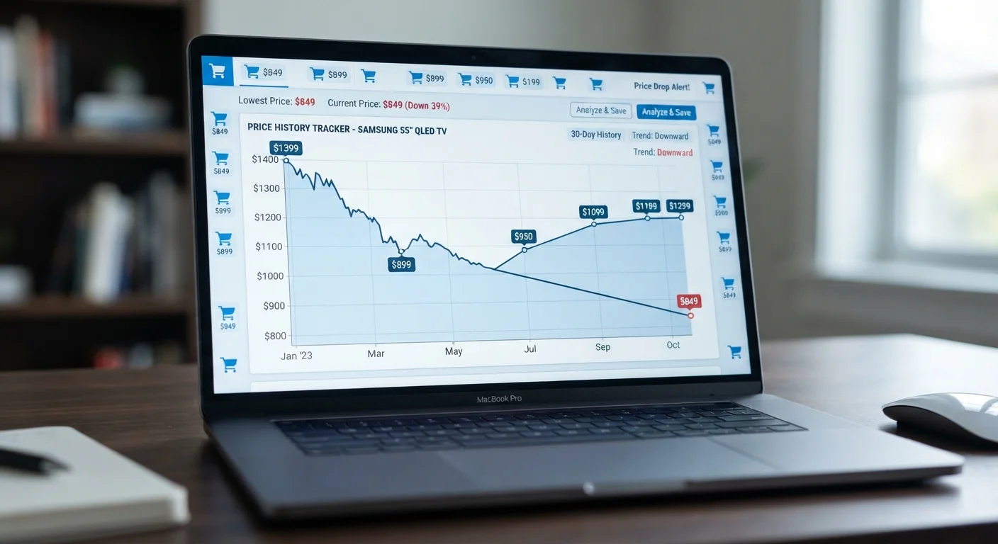
A price history chart is a graph that tracks how the cost of a specific product has changed over time - days, months, or even years. It pulls data from retailer listings and plots each recorded price point so you can see patterns at a glance. Instead of trusting a retailer's claim that something is 'on sale,' you can verify whether today's price is genuinely lower than usual.
Most price tracking tools scrape retailer product pages at regular intervals (often daily) and log the listed price against a timestamp. Some tools also track third-party marketplace prices separately from the main retailer's first-party price, which matters on platforms like Amazon where the 'sold by' entity changes frequently.
Why the Sticker Price Tells You Almost Nothing
Every retailer wants you to believe the price you see today is special - a limited window you'd be a fool to miss. But a price without context is just a number. It could be the lowest this product has ever sold for, or it could be an artificially inflated 'original' price set up weeks ago specifically to make today's 'sale' look impressive.
This is the core problem price history charts solve. They replace the retailer's narrative with a factual record. When you see a product listed at $89.99 with a crossed-out 'was $149.99,' a price chart can tell you within seconds whether $149.99 was ever a real price anyone paid, or whether it was a phantom anchor designed to manufacture urgency.
The practice of inflating a reference price before a promotional event is widespread. The anatomy of a real Cyber Monday deal article covers how retailers systematically set this up in the weeks before major sales events - price history data is your primary defense against it.
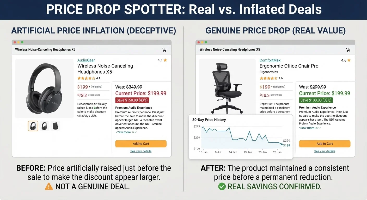
Price history charts don't require you to be a data analyst. Once you know what to look for, reading one takes about 30 seconds and can save you from both overpaying and from waiting unnecessarily for a deal that's already arrived.
The Anatomy of a Price History Chart
A price history chart is a time-series graph - the horizontal axis is time (ranging from 30 days to several years), and the vertical axis is price. Each data point represents the price recorded on a specific date. Here's how to read the key signals:
The Baseline (Most Frequent Price)
Scan the chart for the price level the line returns to most often. This is the product's effective market price - what it costs when nothing special is happening. If today's price is above this baseline, you're overpaying. If it's at or below it, you're at minimum getting a fair deal.
Spikes Upward
Sudden price jumps usually indicate a product went out of stock and a third-party seller stepped in at a premium, or demand spiked temporarily (common with seasonal goods, viral products, or supply chain issues). Don't use a spike as a reference for 'original price' - it's an anomaly, not a norm.
Spikes Downward
Short, sharp drops often represent flash sales or temporary promotions. If a price crashed to $49 for 48 hours once in 18 months, don't hold your breath waiting for it to return there. Sustained downward trends, however, signal genuine repricing - the retailer has decided the product should cost less going forward.
The 90-Day Average Line
Most tracking tools display an average price line alongside the chart. The 90-day average is the most actionable metric for shoppers: if the current price is below it, you're objectively buying at below-average cost. This cuts through promotional noise and gives you a neutral benchmark no retailer controls.
76%
Shoppers who can't verify 'original' prices
A 2022 study by Which? found that 76% of consumers couldn't independently confirm a retailer's claimed original price when evaluating promotional discounts.
23%
Average Amazon price fluctuation per month
Research from Boomerang Commerce found that Amazon changes prices on millions of products up to every 10 minutes, with average monthly fluctuation of around 23% on tracked items.
6 weeks
Typical pre-sale price inflation window
Consumer advocacy investigations have found that many retailers begin raising reference prices 4-8 weeks before major sale events to inflate the apparent discount percentage.
$12-$18
Average savings when buying at 90-day price low
Internal analysis from price tracking platform Honey estimated average per-transaction savings of $12-$18 when users purchased at or below the 90-day price average compared to typical purchase timing.
Understanding this structure is the foundation. The price tracking tools hub covers the specific software that generates these charts and how to set them up for the products you're watching.
Spotting the Difference Between a Fake Sale and a Real One
The most valuable skill price history charts teach you is pattern recognition. Fake sales follow predictable visual patterns once you've seen a few.
Amazon's Dynamic Pricing Complicates Chart Reading
Amazon uses algorithmic pricing that can change a product's price hundreds of times per day. This means a price chart for an Amazon product may show more volatility than the same product on a static-priced retailer. When reading Amazon charts, focus on weekly or monthly trends rather than daily fluctuations - the noise is real but the patterns beneath it are still meaningful.
Price History Doesn't Reflect All Costs
A price chart captures the listed product price, not shipping fees, import duties, or marketplace seller fees. Two products at the same charted price can have meaningfully different total costs at checkout. Always verify the final checkout total, not just the listed price, before concluding you've found the deal the chart promised.
Chart Gaps Don't Mean the Data Is Broken
Horizontal gaps in a price history chart typically mean the tracking tool didn't record a price on those days - often because the product was out of stock, the listing was temporarily removed, or the tool's scraper had an issue. Short gaps are normal and don't invalidate the surrounding data. Long gaps (weeks or months) may indicate a significant listing change worth investigating before you trust the older price data.
Pattern 1: The Pre-Sale Price Ramp
The price rises steadily for 3-6 weeks before a major shopping event (Black Friday, Prime Day, back-to-school season), then drops dramatically during the 'sale' - often landing right back at where it was before the ramp started. The chart looks like a mountain that returns to sea level. This is the most common fake-sale pattern.
Pattern 2: The Artificial Ceiling
A product that has always sold for $60-$75 suddenly has a listed 'original price' of $120 - a number that appears briefly on the chart (sometimes for just a few days) before dropping to 'sale' price. The brief spike to $120 exists only to legitimize the discount claim.
Pattern 3: The Genuine Markdown
A real discount looks different: the price drops and stays down. There's no prior spike to set up the fall, and the new lower price persists for weeks or months. This often happens when a newer model launches, inventory needs clearing, or a retailer decides to become more competitive on a category.
“Retailers are very sophisticated at presenting prices in ways that make you feel like you're getting a deal. The only way to know for sure is to see the actual price history - everything else is theater.”
— Edgar Dworsky, Consumer advocate and founder of ConsumerWorld.org
Pattern 4: The Seasonal Rhythm
Some products genuinely cost less at predictable times of year - air conditioners in October, winter coats in February, grills in September. A multi-year price chart makes these rhythms obvious. The retail calendar for real price lows maps these windows by category if you want to plan further ahead.
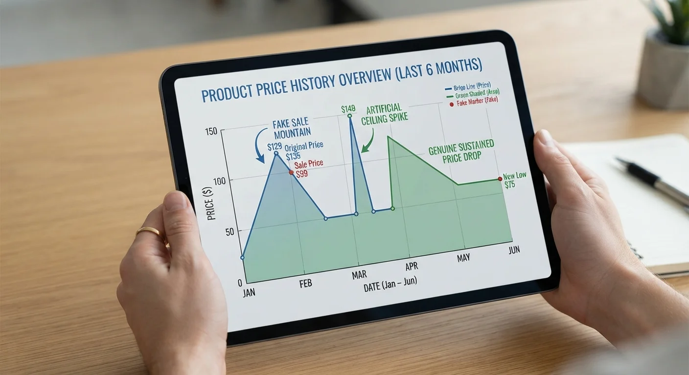
When you see Pattern 3 or Pattern 4, you're looking at a real deal. Patterns 1 and 2 are theater.
The Tools That Generate Price History Data
You don't need to build your own database. Several free tools do the tracking for you, and the best ones surface data without requiring you to leave the product page.
CamelCamelCamel
Built specifically for Amazon, CamelCamelCamel tracks prices across Amazon's own inventory and third-party sellers separately. You can paste in a product URL, view years of price data, and set alerts for when a price hits your target. Its charts are clear and granular, making the patterns described above easy to identify.
Keepa
Also Amazon-focused, Keepa's browser extension overlays a price history chart directly onto Amazon product pages. This is the fastest possible workflow - you never navigate away. Keepa also tracks add-on items, lightning deals, and coupon history.
Honey (PayPal)
Honey's 'Price History' feature covers a wider range of retailers beyond Amazon. It's built into the browser extension and appears automatically at checkout or on product pages. Coverage is less exhaustive than CamelCamelCamel for Amazon specifically, but more useful for Best Buy, Walmart, Target, and similar retailers.
Google Shopping Price History
Google has quietly added price history graphs to many product listings in Shopping results. No extension needed - just search for a product on Google and click through to the Shopping tab. The coverage is inconsistent but improving, and it's a useful quick-check for common consumer products.
Use Two Tools for High-Stakes Purchases
No single price tracker covers every retailer perfectly, and data gaps happen when listings change. For any purchase over $100, cross-check your price history with both CamelCamelCamel and Honey. The 60 seconds this takes can reveal gaps or discrepancies one tool missed.
Set Alerts Below Current Price, Not Just At It
If today's price is already good, set your alert 8-12% below it rather than at the current level. Prices often drift lower after a promotional window closes, and an automatic alert means you capture that dip without having to monitor the product daily.
For high-consideration purchases like fitness equipment or electronics, using two tools in combination closes the coverage gaps. CamelCamelCamel plus Honey covers most scenarios for the average online shopper.
Setting Price Alerts: The Practical Application
Reading a chart once is useful. Setting a price alert turns passive knowledge into automatic savings. Here's how to use alerts strategically rather than just reactively:
- Identify your target price before you set the alert. Use the chart's 90-day average as your ceiling. If the average is $85, set your alert for $75 - a meaningful discount from typical cost, not just from today's inflated 'original price.'
- Watch for all-time lows, but don't anchor to them. If a product hit $49 once two years ago but has averaged $80 ever since, setting an alert at $49 will likely never trigger. Use the realistic floor from the last 12 months instead.
- Set separate alerts for different seller types. On Amazon, a fulfilled-by-Amazon price and a third-party seller price tell different stories. Keepa and CamelCamelCamel let you track these separately, which matters for warranty coverage and return policy consistency - factors the marketplace comparison guide covers in detail.
- Layer alerts with cashback. When your price alert fires, run the purchase through a cashback portal (Rakuten, TopCashback) before completing checkout. The chart got you to a fair price; cashback pushes the effective cost lower still.
Use Two Tools for High-Stakes Purchases
No single price tracker covers every retailer perfectly, and data gaps happen when listings change. For any purchase over $100, cross-check your price history with both CamelCamelCamel and Honey. The 60 seconds this takes can reveal gaps or discrepancies one tool missed.
Set Alerts Below Current Price, Not Just At It
If today's price is already good, set your alert 8-12% below it rather than at the current level. Prices often drift lower after a promotional window closes, and an automatic alert means you capture that dip without having to monitor the product daily.
Alert timing matters for budget gadgets and electronics especially. Understanding what budget gadget specs actually mean helps you set the right target price - you won't overpay for specs that don't matter in daily use.
When Price History Charts Have Limits
Price history data is a powerful tool, but it's not infallible. Knowing where it breaks down keeps you from over-relying on it.
New Products
A product with fewer than 60 days of history doesn't have enough data to reveal meaningful patterns. Launch prices are often temporary - either inflated (for prestige positioning) or discounted (for initial velocity). Wait for at least 90 days of history before trusting a chart to guide a purchase decision on new releases.
Relisted or Reformulated Products
When an Amazon ASIN changes - because a product was relisted, the seller changed, or a version update reset the listing - the price history resets with it. A chart showing only 30 days of data on a product that's been sold for years is a warning sign. Check when the listing was created, not just when the price tracking started.
Bundle and Configuration Variations
Price charts track a specific SKU. If a product is available in multiple configurations (storage sizes, colors, bundle sets), each variation may have its own price trajectory. Always verify you're comparing like-for-like before concluding today's price is a deal.
Amazon's Dynamic Pricing Complicates Chart Reading
Amazon uses algorithmic pricing that can change a product's price hundreds of times per day. This means a price chart for an Amazon product may show more volatility than the same product on a static-priced retailer. When reading Amazon charts, focus on weekly or monthly trends rather than daily fluctuations - the noise is real but the patterns beneath it are still meaningful.
Price History Doesn't Reflect All Costs
A price chart captures the listed product price, not shipping fees, import duties, or marketplace seller fees. Two products at the same charted price can have meaningfully different total costs at checkout. Always verify the final checkout total, not just the listed price, before concluding you've found the deal the chart promised.
Chart Gaps Don't Mean the Data Is Broken
Horizontal gaps in a price history chart typically mean the tracking tool didn't record a price on those days - often because the product was out of stock, the listing was temporarily removed, or the tool's scraper had an issue. Short gaps are normal and don't invalidate the surrounding data. Long gaps (weeks or months) may indicate a significant listing change worth investigating before you trust the older price data.
In-Store and Off-Platform Prices
Most price tracking tools focus on major e-commerce platforms. They won't capture clearance rack pricing at a local Target, or secondhand market value. For context on how brick-and-mortar pricing logic works - especially in secondhand contexts - the thrift store pricing guide offers a useful counterpoint perspective on how prices are set outside the algorithmic retail world.
Building Price History Into Your Shopping Workflow
The goal isn't to obsess over charts - it's to make the check automatic and fast. Here's a practical workflow that adds less than two minutes to any purchase decision:
- Install Keepa or Honey as a browser extension. This means price history appears passively without you needing to remember to check it.
- Before adding to cart, glance at the chart. Ask two questions: Is the current price below the 90-day average? Does the chart show a genuine price level or an artificial spike-and-drop?
- If the price looks right, set a 5% lower alert anyway. Sometimes a small additional dip happens within days of you checking. Alerts cost nothing to set.
- If the price looks manufactured, close the tab. Come back in two weeks. Manufactured sales rarely last, and you'll often find the price dropped further once the promotional window closed.
Combining price history awareness with knowledge of the off-season buying calendar gives you a complete timing system: charts tell you where a product's price is right now relative to its history; the seasonal calendar tells you where it's likely to go. Together, they replace guesswork with a repeatable method.
Amazon's Dynamic Pricing Complicates Chart Reading
Amazon uses algorithmic pricing that can change a product's price hundreds of times per day. This means a price chart for an Amazon product may show more volatility than the same product on a static-priced retailer. When reading Amazon charts, focus on weekly or monthly trends rather than daily fluctuations - the noise is real but the patterns beneath it are still meaningful.
Price History Doesn't Reflect All Costs
A price chart captures the listed product price, not shipping fees, import duties, or marketplace seller fees. Two products at the same charted price can have meaningfully different total costs at checkout. Always verify the final checkout total, not just the listed price, before concluding you've found the deal the chart promised.
Chart Gaps Don't Mean the Data Is Broken
Horizontal gaps in a price history chart typically mean the tracking tool didn't record a price on those days - often because the product was out of stock, the listing was temporarily removed, or the tool's scraper had an issue. Short gaps are normal and don't invalidate the surrounding data. Long gaps (weeks or months) may indicate a significant listing change worth investigating before you trust the older price data.
Price history charts won't make every purchase decision obvious, but they will eliminate the ones that are clearly bad. That alone is worth the 90 seconds it takes to check.